Before a potential customer reads a word of your website, they’ve already made a judgment.
Your color palette, typography, spacing, imagery, and layout all communicate something instantly:
- Are you premium or budget?
- Modern or outdated?
- Established or unrefined?
When these elements feel disconnected, your brand feels uncertain. When they align, your brand feels intentional—and that translate
into credibility.
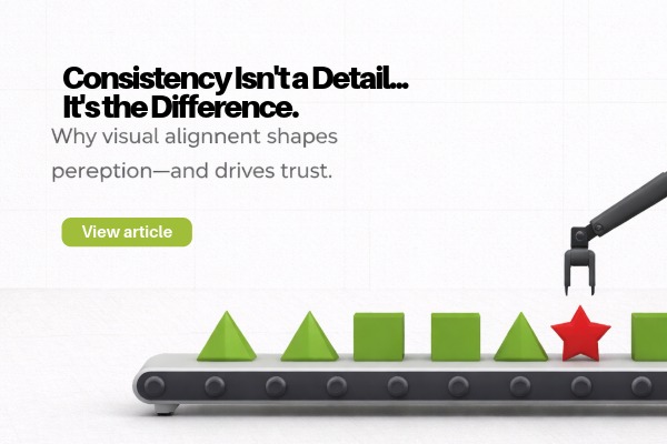
One of the biggest misconceptions in marketing is that branding starts and ends with a logo, It doesn’t.
Your brand lives across:
- Your website
- Social media graphics
- Sales materials
- Email design
- Presentations
- Proposals
If each of these feels like it came from a different company, your brand loses cohesion—and impact.
Consistency creates a seamless experience. And seamless experiences build trust.
Whether you realize it or not, inconsistent visuals can create subtle friction.
It can signal:
- Lack of attention to detail
- Disorganization
- A business still “figuring itself out”
For potential clients making buying decisions—especially in higher-value engagements—those signals matter.
People don’t just buy your service. They buy confidence in your ability to deliver.
The most refined, high-end brands don’t leave visual decisions to chance.
They define:
- Clear typography systems
- Structured color usage
- Image style and tone
- Layout and spacing rules
And then they apply them consistently—everywhere. This is what creates that “effortless” luxury feel.
(It’s not effortless. It’s intentional.)
Most brands don’t lack good ideas—they lack discipline in execution.
Common pitfalls include:
- Using different fonts across platforms
- Inconsistent color application
- Mixing design styles (modern vs. corporate vs. playful)
- Poorly scaled or mismatched graphics
Over time, these small inconsistencies compound into a fragmented brand presence.
Here’s the reality: most of your competitors are inconsistent.
That creates an opportunity.
When your brand shows up with clarity, cohesion, and confidence—it stands out immediately. Not because it’s louder, but because it’s clearer
And clarity converts.
Visual consistency doesn’t mean rigid or boring. It means aligned. It means every touchpoint feels like it belongs to the same brand, telling the same story, with the same level of quality. Because in the end, people don’t remember every word you say. But they always remember how your brand made them feel.